The research world is like a toolbox 🧰. Within the toolbox are surveys, focus groups, and experiments. Recently, the size of this toolbox has increased with social media, internet-based surveys, and mobile phones being used more frequently. The size of our toolbox can be viewed as an opportunity for new kinds of research tools to be utilized for feedback analysis.
Today we will show you just how easy it was for us to go from designing a survey to ➡️ collecting responses to ➡️ feedback analysis and presenting our findings. We did all this within one day using the latest research tools. Read on to find out how:
Step 1 – Identify research problem & select research design
First, we must identify what our research problem is, what questions to ask, and in what format we want to ask them. We decided to examine the topic of website design and selected a single open-ended question survey format to obtain responses effectively and efficiently for easy feedback analysis later.
Step 2 – Utilize Pollfish.com to collect 1000 text responses
After we had our survey question ‘What annoys you the most about websites?’, we used the service provider Pollfish to obtain responses. Pollfish is a platform that grants access to a massive network of respondents who opt-in when a survey is presented to them. Our study required 1000 responses, and within two hours, we had all the responses we needed. In the end, we easily downloaded the data as an Excel spreadsheet, ready for the next step – Feedback analysis!
Step 3 – Use Caplena.com for Feedback Analysis
The survey provided us with a lot of data – now what? Data is only data – it is only through feedback analysis and the interpretation of that, that you create knowledge. In terms of quantitative text responses to open-ended questions, Caplena is the right tool to make your feedback analysis more efficient, accurate, and insightful. We uploaded our Excel file to Caplena and with the click of a button, all survey responses were categorized into identified topics. We completed the analysis of all survey responses within 15 minutes.
👉 Refer to this article for a step-by-step guide on how to use Caplena.
Step 4 – Present results
Caplena gives users the option to present results via interactive charts, such as driver charts and relationship charts, as well as dashboards – or as Excel, SPSS, or CSV files. Dashboards are an easy and visual way to showcase the findings of your study. The first step is to create and personalize the charts that you want to display. Then you will be able to drag them into the dashboard interface and change various settings such as size, color, and descriptions. After completing the dashboard we shared the link with relevant team members.
Check out and interact with the finished dashboard yourself here.
It’s only been a couple of hours, and we have surveyed more than 1000 people, analyzed all the responses, and built a dashboard to share our findings. Below you can read more about the findings of our study.
Findings
Now that we have shared the secret new tools of our research toolbox, let us look at our findings more closely. Below, shows the top eight categories that emerged in the text responses of our survey.

Ads, Pop Ups & Push Notifications
More than a third of our contestants said that these were their biggest turn-offs. But how do you know how much is too much? You know that you’ve overdone it when:
➡️ Your reading experience is interrupted
➡️ It is difficult for you to navigate the site
30% of internet users say that they intentionally avoid websites where ads interfere with the content they are trying to focus on. Let’s just all agree that distasteful pop-ups, ads and push notifications suck and should let us live our lives without guilt-tripping copy like “No, I don’t want to improve my experience.” What’s with the sass? 💁♀️
Take a look at the pop-up below. It is not too pushy, uses delightful copy, and offers alternatives.

Inefficient Code

A page that is inefficiently coded will become slow or crash. QuickBooks even finds that speed is the leading reason people abandon a website. As the load time of a page increases from one second to five, 90% of people leave the page. You can easily check your own page speed by running a Speed Test 🏃.
Unclear User Interface (UI)
Poor UI on websites is still shockingly common – especially when it comes to adapting to mobile phones. Mobile devices drive more than half of all website traffic nowadays. Creating a website that is responsive to that is critical. Over the past 10-15 years, mobile phones have changed our lives so rapidly that many website providers have fallen behind. Make sure you have everything formatted for all those phone users on the go 📱!
Poor Navigation
When someone lands on your site, do they know what to do? Where to go? What their next steps should be? While this might seem like a no-brainer, research by Small Business Trends suggest that 70% of small B2B business websites lacked a call-to-action. They weren’t missing out on leads and sales because their CTAs were poorly written; they were missing out because they simply didn’t provide any direction on their website or ask people to click around. See below for some common design pitfalls when it comes to UI and website navigation 👇


Cookies 🍪
The explosion of cookie consent pop-ups started in 2018 and is partly the fault of the General Data Protection Regulation (GDPR). The change was meant to make it easier for people to understand and control how they are tracked online. In reality, it has made the internet even more unusable. Since there isn’t too much you can do about the laws of cookie pop-ups, refer back to our advice above and make them simple, non-obtrusive, and friendly. People just want to get this part over with. No sense in making it more complicated than it has to be.
Hidden Costs & Wrong Information
A breach of user trust occurs when website information, like payment actions, is disguised to be misleading. It is imperative that you respect your users by providing them with accurate information that is easy to access without trying to trick them into clicking on anything involuntarily. The mere suspicion that your website might infect their devices with malware, for example, is a very bad sign.
Long Registration Forms & Privacy Issues
In addition to being annoying to fill out, long registration forms are less trusted than email addresses. Why? When you enter your information without knowing where it will go, it feels like you are setting yourself up for spam. The more information you make users input – and the more personal the questions get – the less they are going to trust you. For best results don’t just use a web form on the contact page. Include your physical address, telephone number, and personal email address as well.

Even though this point isn’t officially on our respondents’ list, we felt strongly enough about it to include it anyways. Yes, images are great for inbound marketing. Nevertheless, if you go browsing looking for suitable pictures and find gems like the ones below, please, for God’s sake, do not use them on your website. Jokes aside – use professional images – ideally, honest photos – over stock images. Make sure the images are of good quality, too, and you’ll be good to go!


There you have it! We’ve conducted feedback analysis effectively from start to end in one day. Clearly, asking for customer feedback is important for businesses to learn about customer or employee pain points and how to improve the organization overall. We only use the best text analytic tools, that’s why we used Caplena to uncover deep insights about our survey!
Caplena offers many visualization options, for example, the driver chart or the treemap. This blog post is all about the Relationship Chart – although it’s not too good at sticking to just one relationship at a time 😜. Staying in line with its polyamorous spirit, the relationship chart’s tendency to find relationships wherever it looks is actually a very good thing, as it helps us determine which correlations are important, which aren’t, which are strong – or fragile, so that we can design an effective strategy based on these facts, no matter what our agenda is.
Models of data are represented by nodes and links, and the strength of a connection between two nodes depends on their interrelationship. Consider the following diagram ⬇️. ‘Bob’ is a node. Bob is interested in the Mona Lisa painting, which is located in the Louvre, which, in turn, is a museum.

Graphs of relationships can be quite simple, such as the one above. In Caplena’s relationship chart, the concept is the same, but instead of individual people, places, or things, Caplena groups responses to surveys or other types of text comments into bulk categories known as codes.
What’s a code?
Let’s say that instead of one sheet of paper with Bob’s name on it, the node of Bob is a stack of 200 sheets, full of people interested in the Mona Lisa painting. It’s the same principle, but since there is now a stack of people that were categorized as having the same interests as Bob. This is known as a code on the Caplena platform.

Understanding how topics relate to each other can come in handy in a variety of ways. Advanced disease research can employ relationship charts to display links between diseases and gene interactions. By examining these links, you can identify patterns in protein pathways that may contribute to a particular disease. Mind-boggling stuff, isn’t it? A sufficient amount of relationship data will even help you predict the future!
Check out the video below to see how a typical relationship chart would look in Caplena.
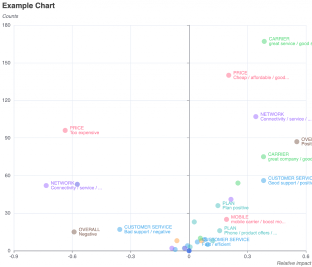
Let’s go through one more example of Caplena usability using an NPS survey on mobile carriers. When you hover over what makes the Unlimited Data code, it shows a correlation with being Cheap/Affordable. This means that when people talk about how cheap and affordable the service is, they often also mention that they have unlimited data.
To stay on theme with the NPS survey of mobile carriers above, imagine yourself as the head of the mobile carrier and how helpful these relationships could be to understand what you need to do to improve and where you should invest your resources. You could invest your time & money in a smarter way if you realize that (for example) unhappy customers are often caused by rude customer service – rather than what you first thought was the issue – connectivity.
There are way more features in Caplena when it comes to this graph, though! You can, for instance:


Want to learn more about creating charts and what chart types are available? Learn more here.
Did you enjoy this article? 🚀 Feel free to suggest more topics and we will do our best to write about it!
✉️Just email our Head of Marketing sheila [at ] caplena.com
Would you like to get started with Caplena and try out some datasets?
If you’re interested in some demo surveys with open-ended questions, we’ve got you covered: Here are 5 datasets with free-text feedback. The files are free to use for your own research or testing purposes but remain the property of Caplena. Distribution, hosting, or commercial use of the data is prohibited.
You Should Know: Upon uploading your survey or another type of open-ended text to Caplena, you will be provided with instructions from our in-app Wizard on how to code and categorize your text comments using our Augmented Intelligence platform. These instructional videos are also available for re-watch on our YouTube Playlist 🤓.
However, before we do that, pick one of the datasets shown below, download it, and get started with Caplena!
| Title | Link | |
|---|---|---|
| 1 | Which mobile carrier are you currently using? Type: Survey | Source: Caplena Survey | Rows: 901 | Questions/Columns: 3 | Keywords: Mobile Carrier, NPS, Smartphone |
Download |
| 2 | What did you do yesterday that could have influenced your sleep quality – positively or negatively? Type: Survey | Source: Caplena Survey | Rows: 901 | Questions/Columns: 2 | Keywords: Sleep, Daily Activities |
Download |
| 3 | What factors influence your satisfaction in your relationship with your spouse or partner, and how do recent events impact it? Type: Survey | Source: Caplena Survey | Rows: 901 | Questions/Columns: 1 | Keywords: Satisfaction, Events |
Download |
Bonus: If you’re interested in creating a dataset by analyzing online reviews, use the Integrations option within Caplena. Simply copy and paste this URL into the Import page to import Netflix reviews for example. Check out the quick video on the right to see how this works 👉
And there you have it! A short and sweet post to get you ready for testing Caplena with example datasets for free!
Want to see real-life examples of how we use Caplena? See below:
How we ran a website satisfaction study and got actionable results in one day
6 things that make Christmas Markets so irresistibly Christmassy
Coop Case Study: Getting actionable Insight from Mass Feedback Analysis
Driver Scatter Analysis is a method for measuring a code’s influence on customer satisfaction (NPS/CSAT). On the Driver Chart, you can see immediately which issues “count” and where to focus your efforts. Like the relationship chart, If you want to determine what customers feel very strongly about, be it negative or positive sentiment, you can use this chart very effectively💡
The Y-Axis shows how many times a code was used, and the X-Axis shows Customer Satisfaction, also known as NPS and CSAT.
It is important to understand that the NPS/CSAT X-Axis is not synonymous with the negative and positive codes☝️. Negative codes such as Bad Customer Service can be assigned without severely impacting the customer’s satisfaction (NPS/CSAT score) 😊
Similar to the Treemap, Driver Charts are therefore great for revealing what your biggest issues are, or, conversely, what your greatest strengths are 🤓
Take, for example, the Example Driver Chart below. Despite poor Customer Service, customer satisfaction does not appear to be significantly affected. The Bad Connection code, on the other hand, has a very low NPS score (which means very dissatisfied customers) and should, therefore, be addressed first.
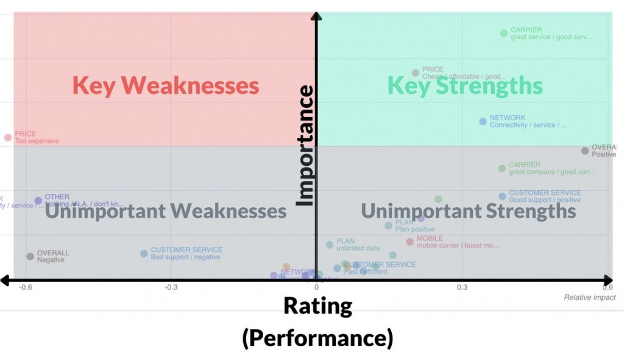
The Driver chart is split into a quadrant with key and unimportant weaknesses on left and key and unimportant strengths on right.
Key Weaknesses 👎 Important but poorly rated. Values in the left-hand quadrant indicate drivers that affect the outcome metric in a heavily negative way.
Key Strengths 👍 Important and highly rated. Values in these quadrants indicate drivers that are substantial in determining a highly positive outcome metric.
Unimportant Weaknesses 😐👎 Not important and poorly rated. In the bottom left quadrant, these values indicate drivers that do not influence outcome metrics that much.
Unimportant Strengths 😐👍 Not important but highly rated. Drivers in the bottom right quadrant don’t influence outcome metric determination.
That’s it for today folks! It is our hope that you will be able to utilize the chart to your full advantage now. As always, don’t be a stranger! You can always count on the Caplena team to assist you with any questions you may have.
Want to learn more about driver charts? Click here.
Today, we will take you through the three steps required to evaluate your open texts survey responses with the help of Caplena, the market-leading text analysis tool!
“What Features/Practices Annoy You The Most About Apps/Websites?”
We asked 800 contestants this question to demonstrate how Caplena can analyze survey responses. In doing so, you will learn how to employ this approach to analyze your own survey data! Are you ready? Let’s go!

The basic principle when having to evaluate free-text (e.g. survey responses) is called Coding: The process of assigning one or more tags or topics to every text element.
When you have assigned codes to a majority or even all of your text elements, you can create statistics, charts, and dashboards, describing your results:
Of course, these steps can be done manually in Excel or by using some other coding software. It even should be done there if you have, say, only 50 text elements. However, this is totally impractical with 200 – and borderline impossible with over 5,000 responses.
Caplena will eliminate much of the repetitive work in analyzing open-ends. Spend more time on the task which requires your insights instead: Making sense of the results.

The first step is obviously getting your hands on the data. There are several ways to accomplish this: Ask your clients for feedback, send out an NPS survey or scrape the web for social media data posts or product reviews.
We support various file types, such as Excel, CSV, or SPSS. You also have the choice to directly input your data in the form of numbers, dates, booleans, strings, NPS and CSAT scores, etc. Using our latest integrations feature, you can also simply copy and paste links of survey-type websites, and download the respective responses like that. See more about our integration features here.

After completing this step, a codebook is generated, i.e. a list of codes (tags) that should be attached to the texts. Keywords, as other tools deliver them, might be Service or Price.
You can also upload a codebook you may have from similar or identical historical surveys so that you don’t need to start from scratch building a new one. We also offer a wide range of survey codebook templates that you can select and then adjust to your specific needs.


We can now begin to make sense of the survey responses after putting the unstructured text into structured categories. Caplena provides a visualization module, in which you can easily create charts and dashboards, which you can either download or share with your team/clients directly through a shareable link.
It is also possible to download all the raw results – the charts themselves can also be exported for use in their visualization toolkit.
It took us less than 15 minutes to create!
The mechanics of creating bar, pie, line, treemap, or graph charts on Caplena are very simple, but making sense of your data is not. Getting to the essence of the data and telling a compelling story with a few words and a few charts is the most critical aspect of any analysis. This is also where you should invest most of your energy.
Within under half an hour, we analyzed our survey responses and have the data ready for presentation on Caplena’s interactive dashboard. So what have we learned? It is all about taking advantage of today’s technologies in the most efficient manner and spending your time on the things that machine learning cannot automate – such as making sense of the results.
Are you ready to learn how to take full advantage of your FREE Caplena SaaS trial? Read below to learn how to use Caplena’s trial feature to the fullest extent! Maybe you want to learn more about how Caplena uses natural language processing to categorize feedback.
The trial period normally lasts between one to two weeks, during which you can fully evaluate whether the coding software will meet your business needs. If you intend to test the coding software properly, make sure you have enough time to do so. Consider when your decision has to be made as well as how the software evaluation process works 🗓️. With collected data, conduct feedback analysis effectively. Take advantage of any demo calls and tutorials the company might offer – bringing us to the next point.
If there is the opportunity to reach out directly to the team, do so! At Caplena, we encourage clients to schedule a demo call before committing to anything. In these sessions, you will be guided through the initial steps of how to navigate the site by a specialist 👩💼. Any questions you might have are also welcome. Another benefit of live demos is that companies often provide you with special offers. Book a Demo with us to see how we handle this 😉
Don’t be afraid to write down any questions you may have, no matter where they may pop up. In addition to discussing how the trial went for you, Caplena always offers a closing call to answer final questions or anything that you might be unsure about. For example, ask about sentiment analysis features or how Caplena uses machine learning.
If you have questions and need an immediate answer, we are also available around the clock 🕐. You can use our live chat to either find your answers in one of our help articles or ask a member of the Caplena team.
Consider including primary stakeholders in the evaluation process and identifying ideal outcomes and processes together. The success of your trial should be shared and discussed with your key team members to indicate how features and solutions relate to your company’s goals.
When starting an evaluation, establish pre-determined success factors so your team can make an informed decision. You may want to consider these questions to get you started:
How much training will be needed at the outset?
What problem is the product supposed to solve?
What is our budget for the service? What is the ROI?
Having uploaded and processed your data to Caplena – what’s next? Text analysis is most effective when it explains key points through graphs, for example, using the relationship chart, understanding the driver chart, and analyzing the treemap! 🚀
Treemaps are used to present large amounts of hierarchically structured data, and, since Caplena’s text analysis results are hierarchical by nature, you can be pretty certain that most of your data will be suited for this type of chart. But – let’s not get ahead of ourselves and start with the basics first ☝️.
A Treemap is a type of graph where quantities are compared and hierarchical structures are visualized spatially through rectangular segments. Within the visualization, these segments vary in size and color and are sorted by a numerical variable. Rectangles contain smaller rectangles to represent the different ‘levels’ ⬜◻️▫️. The main idea of this type of graph is to break up the data so that large and small units can be quickly identified 🤓 🔎.
The concept of a recursive construction allowing hierarchical data extension first originated in the early 1990s by Professor Ben Shneiderman (see the example below for one of the first Treemaps).

How the rectangles of Treemaps are sized depends on the algorithm which is used to define their size. There is an order to Caplena’s rectangle sizing, beginning with the largest square in the top left corner and ending with the smallest in the bottom right corner. The size of rectangles is determined by the sum of their contained areas. Another useful feature within Caplena is that you can interact with the visualization as well. Simply click the desired square to see the coded verbatim responses associated with each square, or double-click on an area to zoom in on less frequent codes.
Imagine you are looking at a world map 🌍, and that the continents are represented by squares, instead. Let’s take Asia, one big square, which is further segmented into 48 squares to represent its countries. Next, we could take Europe – this overall square would be a lot smaller than Asia. Europe would have 44 respective smaller rectangles within it representing its respective countries. See the example below.

Is it not easier to comprehend the continents and their countries using such a visualization? Or would you rather scroll through 48 lines summing up a single continent? In most cases, the Treemap visualization of a continent would be preferred. This is because we do not need to go into great detail about every country to understand the continents’ puzzle pieces; we simply want to acknowledge their existence as a microcosm.
As we are hopefully getting on the same page, let’s bring our attention back to Caplena. Caplena is a text analytics platform helping you reach insights from unstructured text using augmented intelligence. The gold standard in text analysis is to build a topic hierarchy (aka the codebook) and assign the topics (aka “codes“) to verbatims.
After uploading your open-ended feedback, Caplena’s Artificial Intelligence will search for hierarchies, patterns, and trends and gain knowledge from them. Once Caplena is finished, you are left with a set of organized data that has been assigned codes. Thus, the whole idea behind Treemaps is very well suited to text analytics data 🙌.
Having established that Treemaps are good for text analysis, let’s look at Treemap do-s & don’t-s in a more general context.
It is not recommended to use Treemaps for data with a wide range of magnitude, values with negative ranges, or for gauging values based on the length of the plot. Generally, avoid Treemaps for segmentation, as for example, comparing distribution by responded age.
It is recommended to use Treemaps when the data is hierarchical (which entails pretty much all of Caplena’s data). Treemaps offer the main benefit of allowing one to identify the most important elements in an organizational structure at a glance.
We could go on and on – but it’s always best to learn by doing 💪, so we highly suggest you Book a Demo or Start your Trial here (no credit card information necessary!) Try out the different data visualization options, including the Treemap, and let us know how it goes. We are always happy to assist you with any questions you may have 😊.
Video Walkthrough: Text Analysis of Netflix App Reviews
This tutorial is all about Netflix! 👨🎨: We’ll take you through every step required to evaluate your open texts with the help of AI. If you follow the 3 required steps described in the guide below in all detail, it will take you approximately 45 minutes to get to achieve these results.
The basic principle when having to evaluate free text is called coding: Coding is the process of assigning one or more codes (tags or topics) to every text element.

Example: Two codes are assigned to this piece of user feedback.
When you have assigned codes to a majority or even all of your text elements, you can create statistics, charts such as treemaps, and dashboards, describing your results:

Now, these steps can of course be done manually in Excel or some other coding software. It even should be done there if you have, say, only 50 text elements. But if you have 200, this becomes unpractical – if you have 5000 borderline impossible.
That’s why the following guide helps you eliminate most of the tedious work associated with the analysis of open-ends. And enables you to spend more time & thought on the task which actually requires your problem apprehension and insights: Making sense of the results.
The first step is obviously getting your hands on the data. How this is accomplished depends on what you are working on: Ask your clients for feedback, send out an NPS survey or scrape the web for social media posts or product reviews.
In this tutorial, we will use 5,000 feedback responses about the Netflix 🍿 app from the Google Playstore.
As you might have guessed, we’re going to use Caplena to evaluate the data. We might be slightly biased here, but we’re pretty sure this is the hottest text-analysis tool currently out there 😉.
Caplena’s latest integration feature allows you to simply copy and paste the Google Playstore link – and you’re done!
| Required Time | 1 minute |
| Time-saving compared to the manual approach | None |
| Required brainpower | 🧠 out of 🧠🧠🧠🧠🧠 |
Find out more about the integration feature here and register for a free trial here.
The result of this step is a codebook, i.e. a list of codes (tags) that should be attached to the texts. Codes are topics, themes, or concepts that are higher level than keywords. Keywords, as other tools deliver them, might be Service or price. Codes on Caplena look like this:

Codes are high-level concepts and can include sentiment, either explicitly (example #1) or implicitly (example #3).
See how “Service” can mean two different things in different codes – making them much more powerful than keywords.
The process on Caplena is a prime example of augmented intelligence: Our algorithm detects topics, but your industry knowledge and abstraction capabilities are required to improve organization & clustering.
| Required Time | 5-15 minutes |
| Time-saving compared to the manual approach | 75 – 95% |
| Required brainpower | 🧠🧠🧠 out of 🧠🧠🧠🧠🧠 |
After the previous step, you have a codebook and the AI has assigned a code to every review where it thought it made sense. And it only took a couple of minutes.

If we want to, we can now fine-tune the AI. The purpose of fine-tuning can be:
| Required Time | 15-75 minutes |
| Time-saving compared to the manual approach | 30 – 95% depending on the data size |
| Required brainpower | 🧠🧠 out of 🧠🧠🧠🧠🧠 |
Now that we have organized our unstructured text into structured categories, we can start making sense of the feedback. For this purpose, Caplena features a visualization module, which enables you to easily create charts and dashboards, which you can either download or share with your team/clients directly through a shareable link.
Check out this Netflix demo dashboard.
It took us less than 15 minutes to create.
Although the mechanics of creating bar, pie, line, treemap, or graph charts on Caplena are very simple, making real sense of your data is not. Distilling the relevant essences from the data and telling a compelling story with a few words and a handful of charts is the most crucial part of any analysis. It is also where you should invest most of your brainpower.
| Required Time | 5-90 minutes |
| Time-saving compared to the Excel approach | 50 – 90% |
| Required brainpower | 🧠🧠🧠🧠 out of 🧠🧠🧠🧠🧠 |
The process from the moment you have your open-ended text in Excel, to showcasing your results in an interactive dashboard can be completed within as little as 25 minutes. It is all about making use of today’s technologies in the most efficient way while spending your time on the things that machine learning cannot automate – like making sense of the results.
Codebooks (or code concepts) are necessary to organize meaningful insights from a large set of open ends. Asking open questions instead of multiple choice questions with limited answers will increase your chance to capture more authentic and surprising answers from your target group. Responses can heavily vary in their expression and form, even when portraying a common theme. A codebook is a collection of topics, where topics might have one or more sub-topics – or codes. In order to make sense of it, you’ll need to choose a set of topics, that is comprehensive enough to address multiple types of survey responses and narrow enough to generate actionable feedback. Creating this balance is a challenging task.
These six steps will boost your ability to create meaningful codebooks:
Even though humans excel at empathizing, they lack the ability to comb through a vast amount of data, find important keyphrases and interpret them at scale. Using an AI-assisted approach to create a codebook and analyze your data will not only boost your insight quality and speed but will also have a huge effect on your efficiency.
Collecting open-ended feedback from your customers is invaluable to your business. Rather than collecting “stock answers,” you get authentic responses from customers who are interested in sharing their thoughts, opinions, and actionable insights with you. As a result, you’ll be able to make informed decisions about product/service changes and significantly improve customer satisfaction. But in order to effectively collect – and assess – open-ended feedback, you’ll need a meaningful, productive codebook.
Open-ended feedback is notoriously challenging to assess. In an ideal world, all your customers will use the same language to describe similar complaints or insights. But in reality, that’s just not the case. Some of your customers might say your product is “too expensive.” Others will say “your price is too high.” Still, others will say, “I can’t afford this.”
That’s where a codebook comes in: It captures these different terms under one umbrella term. A codebook is basically a list of topics used for organizing verbatim answers. For example, all of the responses described above would be funneled into the code “Pricing: Expensive.” Instead of sifting through the answers one by one, you get instant analysis of open-ended feedback…and instant insight.
Creating a meaningful codebook, that suits your business needs, is a challenge. You’ll need to choose a set of topics or codes, that are comprehensive enough to address multiple types of survey responses and narrow enough to generate actionable feedback. You’ll need to think through what kinds of topics will “help” artificial intelligence funnel the answers correctly. And lastly, you’ll need to consider how to phrase the names of topics.
Here are six steps to help you create a meaningful codebook:

Putting yourself in the shoes of your customers can be challenging for any business owner. You know every aspect of your product or service. You’ve invested time, money, and resources into development, strategic pricing, and functionality. It’s hard to imagine anyone would have anything to complain about!
Still, you’re guaranteed to have a number of customers who have suggestions, critical feedback, and even complaints. And missing out on those insights could be detrimental – even fatal – to the success of your business.
To put yourself in the place of your customer, you’ll need to distance yourself from your product or service. Take a step back and try to imagine you know nothing about your product or service. If it helps, ask (honest) friends or family members to give their opinions. What kinds of answers might your product or service generate to an open-ended feedback question? This line of thinking will help you to get started on creating a list of topics that are both relevant and realistic.
Keyphrases are not the same thing as codes. Codes function as broad topics; keyphrases are narrower in scope. For example, a cell phone provider might use the codeCustomer Service: friendly. Keyphrases that would fall under this code might include Lovely customer support, Nice agent, and Love the friendly staff. Keywords might include “warm,” “personable,” and “nice.”
In the example below, you’ll see the code Pricing: Expensive on the right and the original verbatims on the left. This example illustrates the purpose of codes very well: Grouping a set of quite varied phrases, including misspellings, into consistent groups.

Of course, you can generate your own key phrases and keywords, but you’ll also want to use a form of artificial intelligence to predict words and phrases your customers might use in a survey.
Determining keyphrases and keywords will help you to put together a list of likely codes for categorization. At the beginning of this process, “spread the net wide.” Take a look at the codes generated by AI, and come up with your own. After sifting through about 50 verbatim phrases, begin to consolidate and reduce your codes. Resist the temptation to create a new code for every potential feedback. Ultimately, having too many codes will damage the depth of your insight and analysis. For average studies, we usually suggest ending up with somewhere between 20 and 60 codes.
You might create one code that senses a number of verbatim responses. But after sifting through some more responses, you might realize that this code isn’t as well-defined as you first imagined. If this uncertainty strikes repeatedly, consider merging this code with another to give you more consistent results. For example, you might merge the codes Customer Service: Long wait time and Customer Service: Make more responsive. Both of these phrases will be used to communicate essentially the same idea. Don’t torture yourself by differentiating between codes that are hardly distinguishable.
Codes function as categories in and of themselves, but they should also be grouped into higher-level categories. Your upper categories might include “Pricing,” “Customer Support,” or “Usability.”
Names should be concrete and concise. A bad example of a code name would be, Location has satisfying vibe / makes you like spending time there. A better name would be Atmosphere: Positive.
In any case, don’t include more than 10 codes in one category.
Around 10% of your responses from a customer survey won’t be helpful to you. Either they are nonsensical (“asdf….”), useless (“I don’t want to write anything”), or too generic to be helpful (“great job.”) Don’t strive too hard to interpret an open-ended response that doesn’t serve your business, or use it to generate a new code. Ultimately, that approach will damage the effectiveness of your analysis. Instead, create one catch-all code that will be useful for the less-than-useful responses, i.e. “Not Applicable.”
Likewise, consider actionable results.
Be pragmatic.
Ultimately creating a codebook can be an extremely valuable strategy for turning your open-ended feedback into valuable, actionable insight for your business.
Of course, you might be thinking, Sounds great! But how do I generate open-ended feedback? 🤔
Gathering open-ended feedback for your business is most effectively done with a Net Promoter Score (NPS) survey. This simple, 2-question survey allows you to gather NPS – a metric used to generate customer satisfaction – and open-ended feedback, asking customers to explain their ratings.
Caplena is an AI-powered software that can significantly simplify the process of feedback analysis and codebook design – allowing you more time to work on your product or service, reach new clientele, and strategize for your business.
How can we help?
Caplena also offers you codebook templates that make the process even easier.
Other Useful Links: